The Nothing Phone (1) is one of the most polarising smartphones to have ever launched, at least here in India. At first glance, its quirky-yet-functional design seems to target youngsters. But then, at Rs. 32,999, it falls in the same performance-centric line-up of smartphones from Redmi, Poco and iQOO.
Nothing Phone (1)
₹32,999
What Is Good?
- Head-turning design
- Decent cameras
- Near-stock UI
- All-day battery life
- Swift software updates
What Is Bad?
- No charger in the box
- Slowest charging in the segment
- Very little performance headroom
- UI is buggy sometimes
- Poor selfie camera
These smartphones offer some serious on-paper specifications, but then to cut corners, they have bloat-ridden UIs and very similar designs and form factors. In essence, they have Nothing to stand out from the crowd.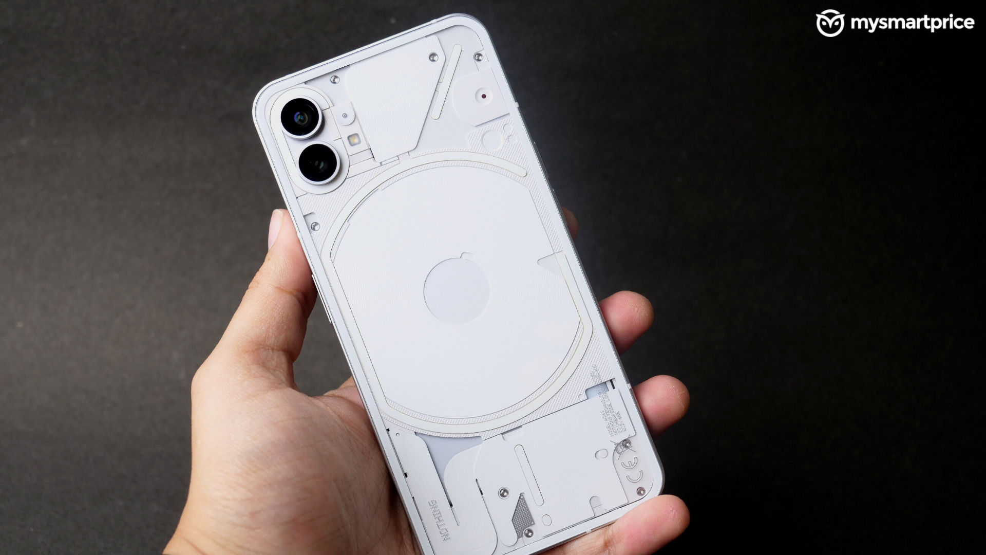
The Phone (1) is a smartphone that was so hyped at its launch that it became cool to hate it. On paper, yes, the Nothing Phone (1) has very mediocre specifications – a dated Qualcomm Snapdragon 788G+ SoC, dual 50-megapixel cameras, a funky naked rear design that seems very similar to Apple’s iPhones and of course, the glyph interface.
When asked how they feel about the Nothing Phone (1), our not-so-tech-savvy friends said they had no clue such a thing existed, and the tech-savvy ones said they were massively disappointed, and the hipsters said ‘I’m in for the challenge, so I’ve pre-ordered one solely on Carl Pei’s promise’.
When we first experienced the Nothing Phone (1) a couple of weeks ago, we were more than willing to look through the hate and see the smartphone for what it was.
We have learnt repeatedly from audience interactions on our YouTube and Instagram channels that specifications aren’t everything for everyone, and having a reliable, wholesome user experience is something many customers crave in the long run.
In the two weeks of using the Phone (1), we have realised that it can evoke a dilemma while making a purchase decision – you’ll have to mediate the fight between your rational mind and the rather impulsive heart. And having fought both for so long here’s our review to make it clear if it’s the right choice for you.
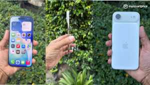
Nothing Phone (1) Review: A refreshing new design
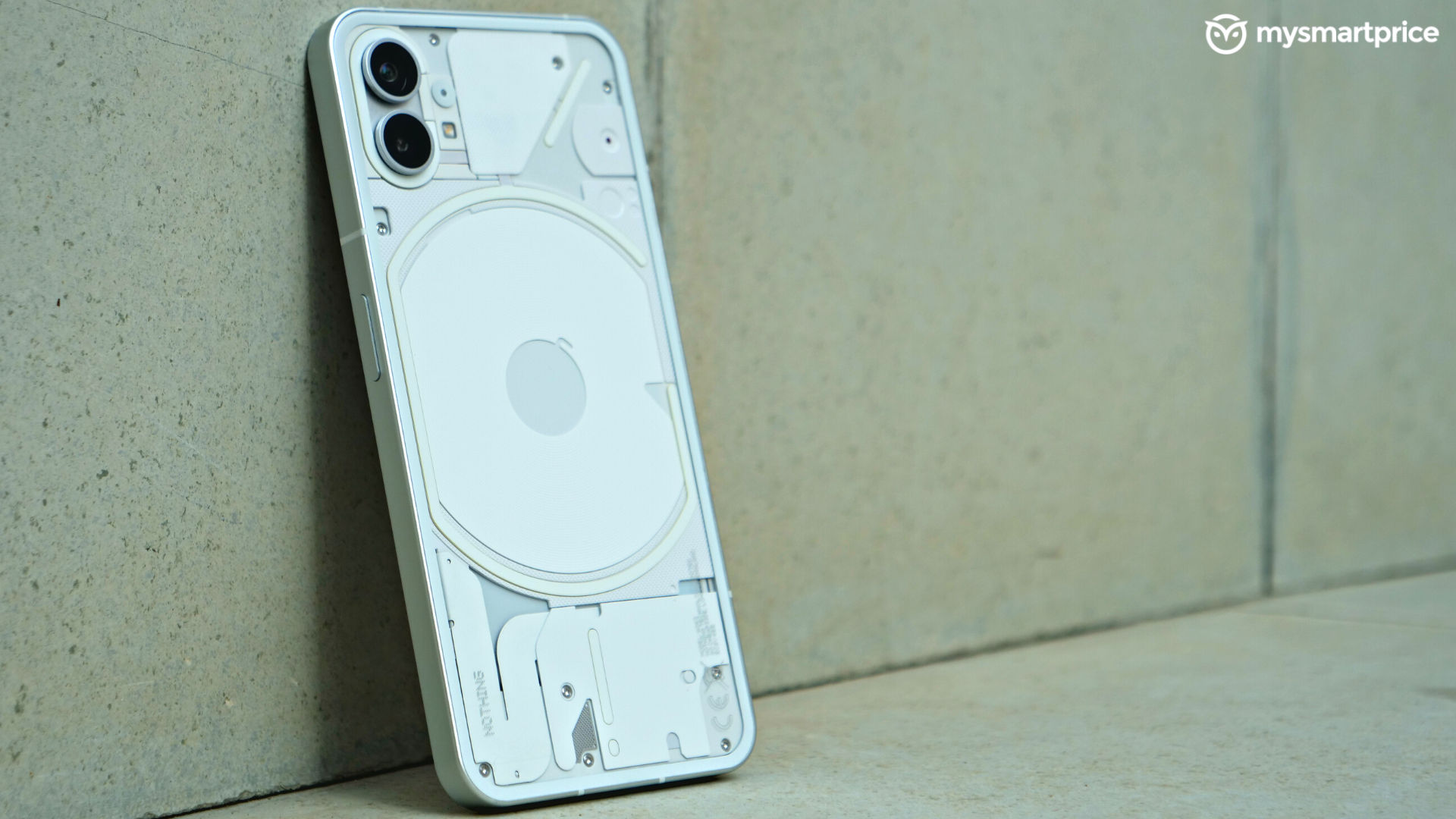
The naked, lit-up design of the Nothing Phone (1) has been the talk of the town for months. Holding the Phone (1) in your hand for the first time is an experience that will stay with you for a long time, no matter how many smartphones you have seen. The coarse aluminium frame, entirely flat and glossy glass back, the way the buttons are shaped and their tactile sensation, and of course the lights, which Nothing calls the ‘Glyph’ – it’s easily one of the most premium-feeling smartphones ever made.
The way the LEDs and the components (especially the charging coil) come together to stitch the empty space of the rear panel is refreshing to see. But, unfortunately, rear glass backs have become boring because it seems like we have seen nearly every permutation and combination of textures, glitters and shimmers on them. Also, fun fact – although the rear glass seems to have only two cutouts for the cameras, there’s a third hole for the mic as well – that’s something very easy to miss.
The squared-off design of the Phone (1) does resemble that of the iPhones, from the frame to the buttons, and it seems purposeful on Nothing’s behalf. However, we see nothing wrong with it because it’s different enough that you’ll never feel it’s aping an iPhone once you start using it.
There were several concerns surrounding the dust and water resistance of the Phone (1). Yes, it does have an IP53 rating, but it’s not waterproof. As usual, we abused the Phone (1) by taking it to the shower to watch videos, and despite a shortfall on a wet bathroom floor, it was functioning just fine, and the rear panel was still pristine.
In terms of a button, port and grille placement, the bottom of the phone hosts the USB Type-C port, a speaker grille and a dual SIM slot. The right has the power button, the left has two individual volume buttons, and the top is nearly clean with a single mic hole.
This is a design not everybody can pull off, but if you’re someone who lives strictly for the flaunt value of things, you should go for this. No phone will turn as many heads as this one regardless of where you are – in a public commute, a meeting or even a bar.
Nothing Phone (1) Review: A display that’s just fine
The 6.55-inch Full HD+ OLED display is fun from the get-go. The 120Hz refresh rate, along with the fluid animations of the UI, makes it extremely enjoyable to use. The saturation of the display is on the higher side, and the colours look way more vibrant than they actually are. This helps in making the display stand out, but if you want something colour accurate, you may have to look elsewhere. The Nothing Phone (1)’s default wallpapers with striking colours take full advantage of this saturated nature of the display. However, we don’t quite understand why they are so badly optimised for the built-in weather and time widgets with a dot matrix font. There’s not a single default wallpaper that doesn’t clash with the widgets.
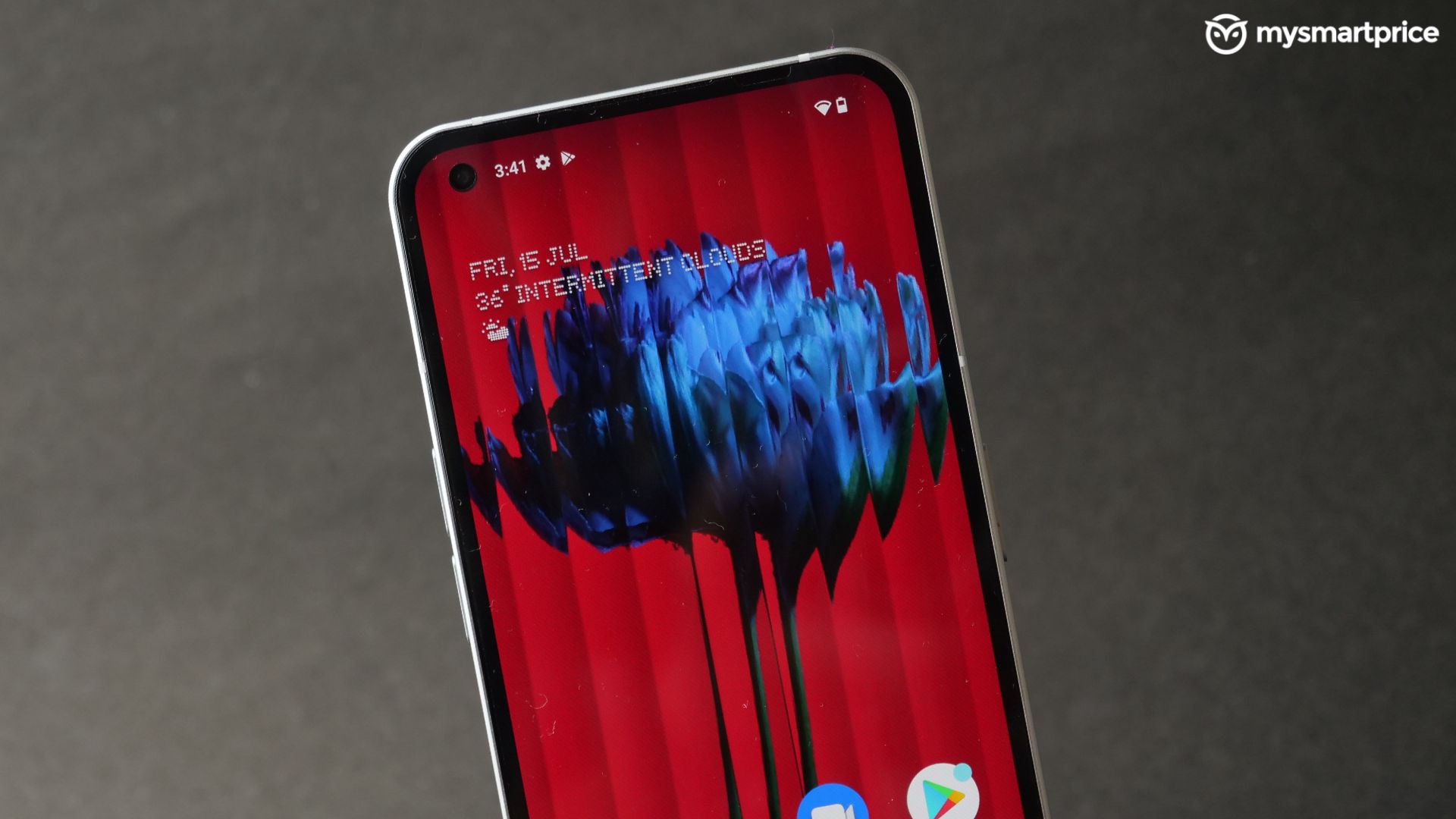 Moving on, the bezels of the display are symmetrical on all sides and corners, yielding it an even more iPhone-esque feel. Unfortunately, it’s not the brightest panel at a price, so it suffers from considerable glare.
Further, while it’s an HDR10+ compliant panel, Netflix doesn’t run HDR content, but YouTube does. We have spent several hours a day watching content on display, and it’s not something that blew our minds. The display becomes warmer when watching stuff on Netflix, and it can sometimes become evident.
To accompany the visuals, the Nothing Phone (1) has stereo speakers, which aren’t symmetrical and don’t offer any fancy Dolby Atmos or DTS certifications. The bottom speaker is the dominant one and muffling it results in losing about 80% of the sound. As a result, the overall sound can get loud but lacks depth, and the highs often stand out more than the bass.
But the haptics are top-notch, good enough to compete with the iPhones. The vibrations can be felt precisely on your fingertips and aren’t buried somewhere in the frame of the phone. This is a lot of fun, especially when you’re typing or playing games that use vibrations as force feedback. It isn’t the most intense motor, though, so you can still miss calls and notifications when the phone is in your pocket in vibrate mode.
Nothing Phone (1) Review: No serious hardware chops, but can the UI make up for it?
Apart from its design, the Nothing Phone (1) was also hyped for its user interface based on Android 12, Nothing OS, before its launch. We have used the phone for about three weeks, and so far, it has received two major updates in this duration. 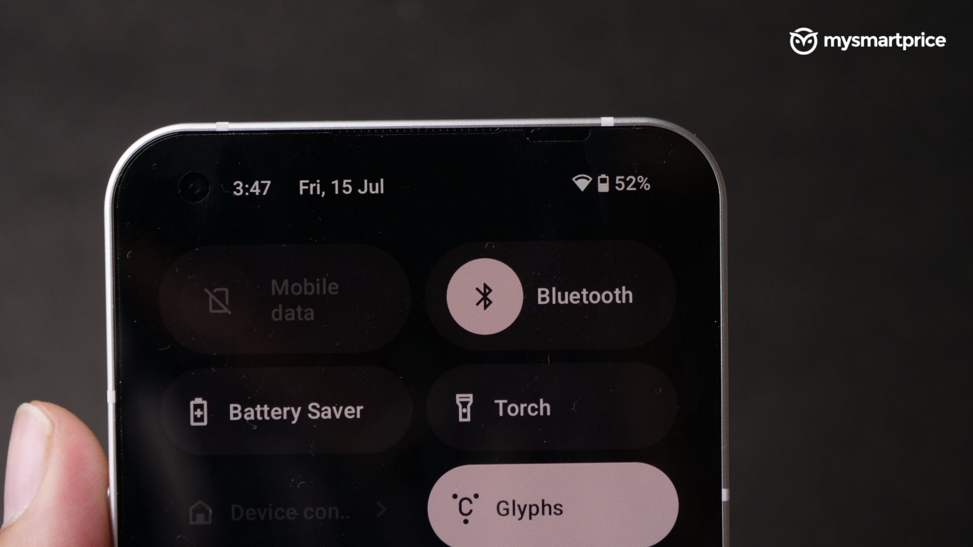
Booting up the phone for the first time was magical – it took precisely 20-30 seconds to dive into the home screen, and only our Google ID was asked – no unnecessary third-party consent boxes to tick.
The first few hours with the phone were also promising. The interface felt smooth, and the animations, though quirky, were cohesive. It’s a barebones Android experience without any bloat, except for the tweaked camera, calculator and recorder apps, which we quite liked. The lack of spammy notifications was also such a breath of fresh air while using a phone worth this much.
The Glyph interface, along with the new ringtones, was very exciting, and it even prompted us to change our habit of using phones on vibrate. We were quick to assign some ringtones and glyph effects to our contacts just to test if we could, in fact, use the feature as much to justify its inclusion.
But then, from the second day onwards, things took a bit of a strange turn, and it became evident that this was indeed a mid-tier device with mid-tier specifications.
The lock screen is something that marks the starting point of any smartphone session, and many of our annoyances with the phone still lie there, despite a few fixes via the software update. The fingerprint animation wouldn’t appear even when the phone was raised, requiring at least two to three attempts of us incessantly pressing the bottom of the screen. Opening notifications from the lock screen were also very inconsistent. Sometimes, double-tapping a notification didn’t prompt the fingerprint scanner to glow up or darken the rest of the display, which is something we expected from other Androids. There were also times when we were sure that we had opened a notification from the lock screen, but the app crashed after our fingerprints were authorised. Unlocking the phone sometimes showed either a white screen or our blanked-out wallpaper for a good three to four seconds. This happened more often than not, and it was irritating because the phone became unresponsive in this time period.
There were also times when it felt like the phone woke up in a rude mood with an extremely sluggish touch response. Locking and unlocking the phone would reset this particular peeve.
The second update reduced the frequency of these bugs. Nevertheless, they can be unnerving when trying to do important things in a hurry, like paying the cashier using the phone at a busy superstore.
Our love for the stock nature of the Nothing OS was unaffected by these issues, though, and it’s a blast to use the phone otherwise.
Did we manage to use the glyph interface on a regular basis? No.
But that’s only because we spent most of our time indoors when we had to keep the phone facing up. We did see ourselves keeping the rear up at cafes and meetings for both practical and flaunt value. It almost acts as your wingman or social lubricant in public settings because it’s so easy to break the ice with a stranger.
 The Qualcomm Snapdragon 778G+ SoC is just adequate for most tasks, but it does sometimes slow down and heat up during heavy multitasking with navigation and YouTube PiP running simultaneously.
Gaming on this is totally possible, sometimes even in higher graphics settings in Call of Duty: Mobile. But do not expect it to perform even remotely close to the Pocos and iQOOs of the world available at this price. On the other hand, this phone isn’t being advertised as a gamer-friendly phone, so we’ll let this slide.
Do note that our experience was with a Nothing Phone (1) having 12GB of RAM and 256GB of internal storage, so your mileage may vary if you go for the lower configuration.
Overall, in terms of day-to-day usage, we would like to give the Nothing Phone (1) a bit of a lead over other UIs with faster hardware simply because of the lack of bloatware and the tendency not to collect your data through third-party apps. Apart from the annoying little quirks, the UI is Nothing. Should work harder to make it more optimised as soon as possible.
Nothing Phone (1) Review: No macro cam, thank you!
Going by the launch stream, Carl Pei seems to be taking pride in the fact that there are no generic, run-of-the-mill cameras in the Nothing Phone (1). The rather simple dual camera setup consists of two 50-megapixel sensors, with the Sony IMX766 leading the way and the Samsung JN1 accompanying it for ultrawide duties, and we aren’t complaining about the lack of a dedicated macro sensor at all.
Summing it up in a single statement – it’s a mixed bag. We compared images clicked by it side-by-side with the Poco F4 5G, the much higher-priced Oppo Reno8 Pro, and the iQOO 9T. It clicks flatter, detail-rich photos without a ton of processing applied in photos clicked from both cameras. 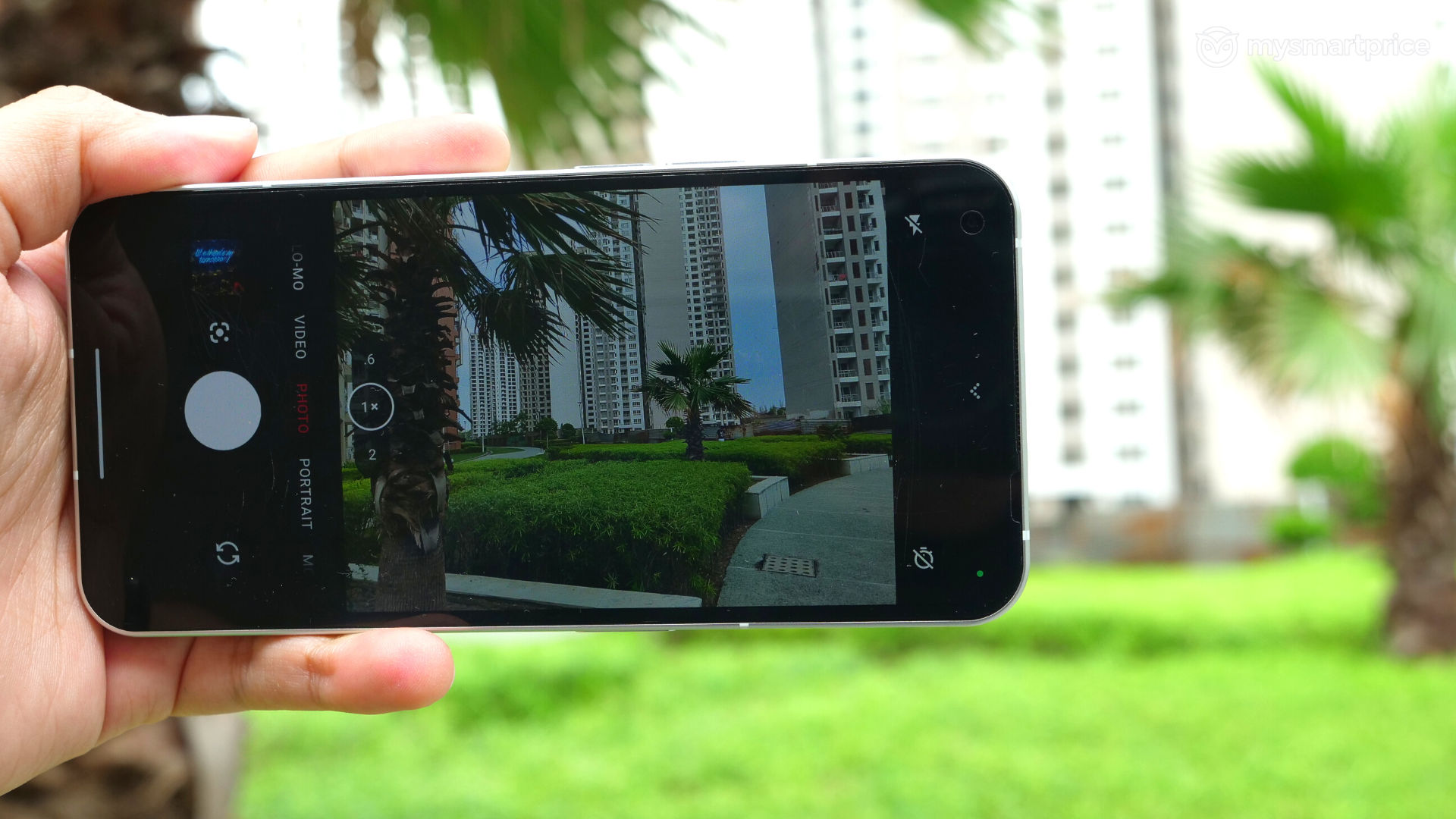
In the day, the blue and green tones aren’t boosted much, leaving a ton of scope for photo editing, but they aren’t Insta-worthy immediately after being clicked.
The phone does an excellent job of applying natural HDR in images with harsh backlight, so a photo with a sunset in the background appears as it did in real life.
The high-resolution ultrawide is also a godsend, and it doesn’t seem like an afterthought as it does in the Poco F4 5G. Sure, the output is 12-megapixel by default, but the pixels in the edges and the corners don’t appear like a bunch of Legos.
The portrait mode also works well. Cutouts of subjects look natural, and there’s no aggressive HDR processing creating a halo. The colours don’t seem overdone either.
That said, the camera does have the tendency to click photos at a lower shutter speed, even in good lighting. This behaviour quickly gets annoying at night because no matter how still you stay, the photos appear blurred. This is despite the fact that the primary camera is optically and electronically stabilised. Night photos also have the tendency to be a bit too yellow at times.
There are a few unique ‘Nothing’ touches in the camera experience, though. For instance, you can use all the glyph LED lights to act as a soft fill light. We preferred some shots clicked with this over the standalone flash because using the latter results in yellowish photos.
Oh, and there’s also a red recording LED indicator at the rear that glows up when you record videos. The weird thing is you can’t turn it on and leave it like that in the settings – you have to manually tap on an icon every time you record videos, which may make you feel very childish.
Speaking of videos, the phone can click up to 4K at 60fps, but HDR videos can only be shot at 1080p at 30fps. All resolutions are electronically stabilised, but some jittery artefacts can be seen in 4K when panning and tilting the camera. The output is decent as long as there’s good lighting, otherwise, it becomes grainy real quick. Also, you can’t transition from primary to the ultrawide camera and vice versa while recording videos.
The selfie camera is forgettable, though. It lacks the dynamic range and consistently blows away the highlights if you have a backlight. It’s either you or the background in such scenarios. And if you’re wearing black, be prepared for a ton of noise on your clothes.
Nothing Phone (1) Review: Glyph doesn’t eat into the battery life
We had concerns about the battery life of the Nothing Phone (1) because of the glyph interface and whatnot, but it turned out to be decent. We were able to consistently churn out six hours of screen-on time in the first week without issues, but it came down a bit after installing about 20 apps required to get through a typical day. 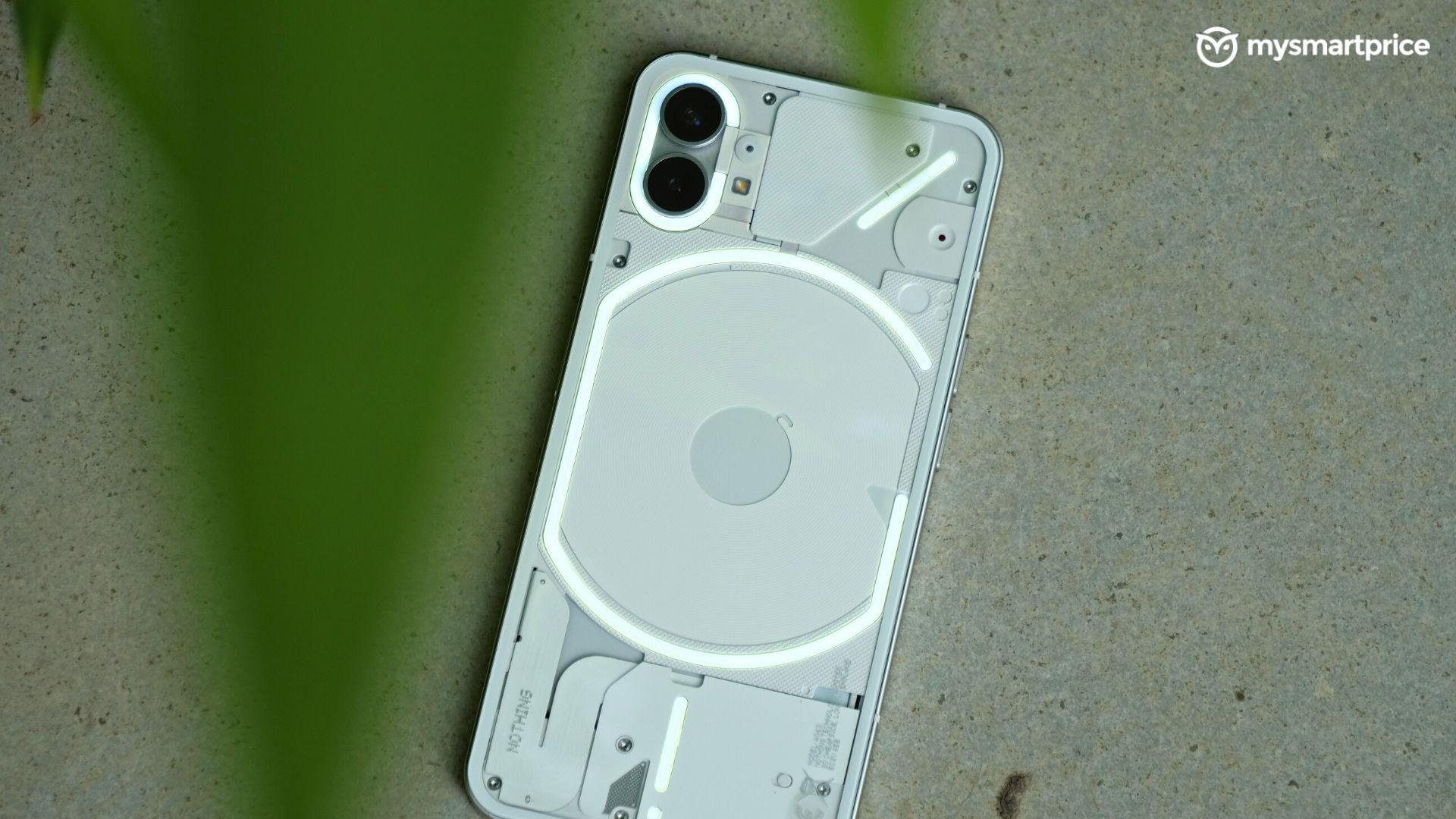
We initially got a day and a half worth of use from the phone, but some location-intensive food and grocery delivery apps did bite a chunk of that, leaving us looking for a charger by 9 at night after starting the day at around 7.
The Phone(1)’s 4,500mAh battery can be charged using a 45W charger that you’ll have to buy separately for a rather steep Rs. 2,499, but you can use USB Power Delivery compatible chargers too. Also, the phone only supports 33W charging, which is strange given the wattage of the power brick. Our unit had a bug where the phone wouldn’t charge again after disconnecting it from a USB-PD charger until it was rebooted, but this was fixed in the second software update. It takes about half an hour for a 60% charge and about one hour and 15 minutes for a full charge. This is disappointing, given the charger isn’t even in the box, and it takes quite a while to top up.
The glyph interface isn’t that battery intensive. Having it turned on continuously for an hour only brought the battery down by 3%. A day’s worth of notifications will barely take up about a fraction of a percentage.
Nothing Phone (1) Review: Verdict
Having used the Nothing Phone (1) for two weeks while trying out other hot smartphones priced way above it, we have developed a strong opinion. It’s clearly not for everyone, and the Snapdragon 778G+ lacks performance headroom in this tier. The cameras are better than the competition, but only because we excuse the competition for its performance-centric nature. Despite its stock appeal, the UI is buggy in its current state, but it’s not bad enough to take away the fun. The battery life is fine, but the lack of a charger and mediocre charging speeds is a bummer. 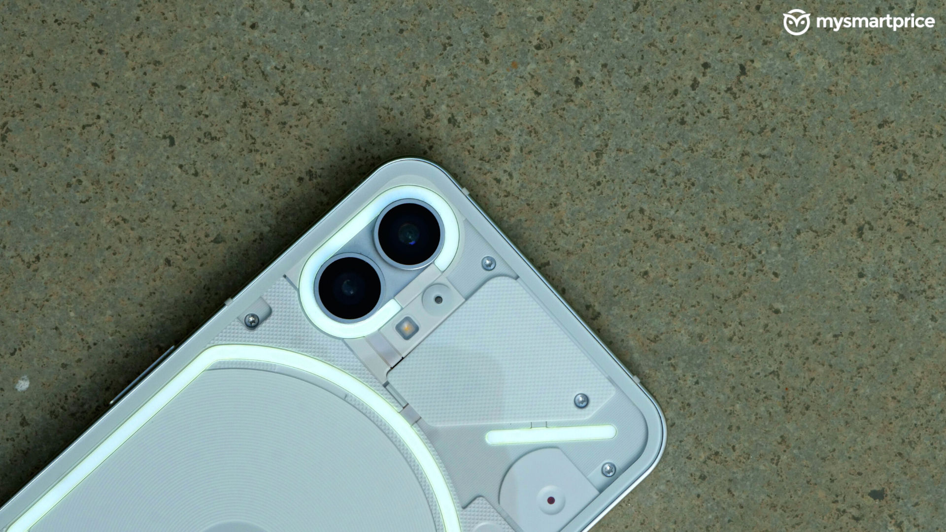
Its pros and cons are evenly matched in every aspect except one – the visual appeal. And we believe that’s what justifies the price.
It was a myth until now, and now that it’s out in the real world makes it a hot commodity. There aren’t a lot of phones left in 2022 that can turn heads, not even the foldable. But this one screams for attention and doesn’t seem to be made for any specific demographic. If you’re a person who is into the status quo, put your money in it. Nobody will judge you for sporting a glittery phone made in 80 Cheapside, London – you do you!